This blog is supported through the affiliate links below
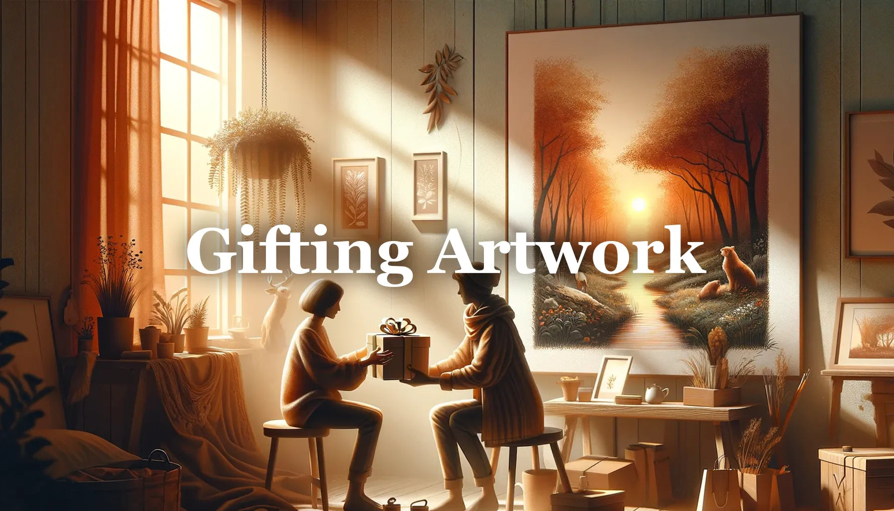
Painting Realistically: An In-depth Look at My Process
I think the hardest type of paintings for me are the types with a lot of intricate tree detail and bright colors throughout. It can be so tough to figure out what elements to add first, how to layer each color, and when to add the details. In this post, I'm going to take you through my recent painting, "Blissful Solitude," with some step by step explanations and hopefully help clear up some of this for you.

Note: This blog contains affiliate links and purchasing through them supports our site at no extra cost to you.
Now in order to explain how I achieved some of the effects in this painting above, we first have to start at the beginning. I'm talking of course about the surface I paint on. For me, this is the most important part of the entire process. If I have too much or too little texture on my surface, it can lead to problems for me very early on. A lot of painters I know love to paint on smooth board, but I prefer to have just a slight amount of texture. This can be achieved by either applying additional gesso to any stretched canvas or by using a more finely woven canvas. I prefer to use Fredrix Knickerbocker rolled canvas which I glue to hardbord.

In some cases, I even like to sand the Fredrix down and apply a little extra gesso to smooth it out even more.
When it comes to beginning the painting, I start out by doing what I call an active wash rather than toning the canvas. I like to do this because the white color of the canvas beneath creates that bright luminous look I'm always after in my light sources. Here's what it looks like after my initial layer of paint.

My main goal here is to establish the darkest of darks, the lightest of lights, and a general color scheme. I try not to focus on any specifics whatsoever as you can see my cabin as well as my mountains are simply a plain wash of dark gray. For this initial layer, I used Liquitex Soft Body acrylic paints and a bit of water. I consider this to be a block in of my painting and it is the only part of the painting I used acrylics for.
I prefer to use acrylics for the first layer as it allows me to easily make adjustments if I need to. It also dries very quickly which is nice if I need to make to changes and add additional layers. Once dried, I lightly coat the painting with a layer Crystal Clear by Krylon for an isolation layer before I begin with oils.
Oils are definitely not necessary to accomplish the things that I do, but it certainly makes it easier on me when it comes to achieving soft blends and bright, beautiful colors.
What colors did I use?
The colors I used for this painting included titanium white, chromatic black, cadmium red light, hansa yellow light, cobalt blue, quinacridone magenta, cadmium orange, and phthalo blue (green shade).
For the sky, I used cobalt blue and gray for the blueish portions. When it came to the pink clouds, I used the magenta with some white. As it got closer to the sunlight, I added orange and yellow with a bit more white to brighten it up. The water was the exact same color mixtures.
For the trees I used a lot of chromatic black along with some phthalo blue and yellow. That created that muted greenish tone for the pine bows. I mixed mostly red and black together for the reddish glow on the large tree. I added a bit of white and orange to that same mixture to get the subtle brown color of the bark.

The cabin was pretty similar to the trees. I used black, red, white, and orange for the logs and light. I added some magenta for the right side of it. The roof was cobalt blue, black, and a touch of white.
When it came to the foreground, the grass was mainly yellow, orange, and a bit of black. I used more orange near and in the highlights and then added some cobalt blue to the darker areas.
Now on to the painting...

The next thing I always try to do is separate the painting into a few larger segments. In this case, there was the sky, the mountains, the foreground, and the dark portion of trees in the upper left (pictured above). I try to work on each part individually before tying it all together. There's no particular order in which I have to do this, but I tend to prefer to work from top to bottom and dark to light.

The dark trees to the left, although required a bit of time to do, were fairly straight forward and simple. I added a slight amount of yellow and orange to my black to create some subtle highlights.
The sky which is what I'm working on above, was painted using magenta, cobalt blue, white, and black. I did add a touch of orange and red when creating some of the brighter highlights. I used an angular brush to lay on the colors that I wanted and then a softer round brush to blend it out.

The next step was to start making those dark trees appear a little more realistic. To do this is surprisingly easier than one might think. Using a smaller round or even liner brush, I used the pink and blue colors from the sky and tapped on small dots and lines of color which broke up the trees (pictured above). These tiny marks began to create what looked like openings in the trees where we can see the sky shining through.
At the same time, I started to use a thin round brush to paint on some fine branch detail. The sky I had let dry prior to doing this so that the black would layer over the top and not blend with those bright colors (seen below).

After sharpening up those tree branches, I continued to build up the lighting effects on the trees by the sun and behind the house. I used a lot of cadmium orange and red to create a glowing effect.

Once I had a lot of that area around the cabin cleaned up as well as the trees roughed in above, I began to build up the distant mountains to the right. For the majority of these mountains, I used a dagger striper brush by Princeton. I love this brush for the precise fine lines it produces and its ability to hold a lot of paint. It also creates some very unique texture rather quickly when needed.

For the bark on the trees (pictured below) I applied a base coat of the red glow prior to adding detail. Once that was on, I used a dark mixture of black with a bit of red to paint on the outlines of the bark. This on its own almost created the effect I was after.

I continued to use the dagger striper brush for a lot of things throughout the rest of the process. It made great looking bark, highly detailed grasses, and precise foreground details.
Another great application for the dagger striper is adding the details on the house. It worked especially well for the texture on the roof. I used the long, narrow edge to pat on the appearance of shingles. It was also helpful for painting the trim around the windows and edges of the logs.

I approach cabins almost the same way that I approach any object. I start by blocking in the darker values and let them dry. Once dried, I go over the top with the colors of the final element, whether that be a log, window frame, illuminated doorway, etc. Once those colors are on, the cabin takes on its final look, but without much detail. I like to think of this phase as the "plastic look," as the texture-less features almost make it look fake. The real magic comes with the final touches when I add small cracks in the boards, subtle highlights, and dark shadows. I can sometimes add those final details in while the paint is still wet, but sometimes have to wait for it to dry before I can add them.
For painting the water, I applied a base coat of pink which gradually faded to a darker blue/gray. Then while the paint was still wet, I added a touch of black to my mixtures of color to paint in the ripples and waves. I again used the dagger striper brush for this.

Continuing with the grass and foliage, you can see that I had already laid out a lot of subtle texture. I used cobalt blue, yellow, black and a touch of white. For the brighter areas, I added more yellow and for the darker areas I added more blue. Occasionally I added a touch of orange for the spots that had more light reflecting off of it.
I built the colors up again from dark to light. I would add some medium toned leaves to some areas and then finish by speckling on some brighter highlights over the top for example. The subtle texture then began to get mostly covered up. I left some of it to show, but very little.

In the above photo, you can see me adding the initial highlights over the top of what I had already roughed in. Below is after I've begun to fill in more of the foliage area.

At this point I'm starting to go back in with a dark mixture of black and blue to darken the shadows in and around the grass. My goal here is to sharpen up the logs, create more depth, and start to draw the viewer's eyes in. I like to use black to create dark shadows near the edges of the painting to help the center stand out more and bring the focus there.
After adding the darks, I used the same brush to add some larger leaves over the top.

At this stage, I was beginning to wrap it up. I went back over the top to add a few highlights, flowers, and smaller details.

To paint the flowers, I simply mixed up some vibrant colors and spotted them on with the sharp point of my dagger striper brush. To me this is the most relaxing part of the painting as it becomes difficult to mess it up. I didn't add too many highlights to these flowers as I wanted to keep the focus on the sunlight and cabin.
After wrapping up those final flower and highlight details, I was pretty much done. If you're interested in watching me paint this piece from start to finish, here is the timelapse video I posted on my youtube channel:
The most important thing I can stress is that I did not rush any portion of this process. I carefully and meticulously added everything one tiny brush stroke at a time. This is an extremely daunting task and can be a frustrating one as well. For me however, I find peace and enjoyment in this type of work. I think finding something you truly enjoy working on like that is the key to a great painting. So just make sure that whatever you are attempting to paint, that it's a process you thoroughly enjoy. The outcome should never be the goal. Instead, our goal should be a process that makes us happy and fulfilled as artists, because that will ultimately lead to a great outcome.
To varnish this painting, I used gloss gamvar.
I hope you enjoyed reading through this more technical and detailed write up of how I completed this painting. If you have any questions at all about my process or something specific regarding this piece then please leave them in the comments below. I'll be happy to answer and leave a reply!
Happy painting :)
Grow Your Painting Skills and Resources
Instant access to 1000s of royalty-free reference photos of landscapes and wildlife as well as step by step oil painting videos. Checkout My Memberships for more info.
I'm Chuck Black, landscape and wildlife artist based in Southwest Montana.
Explore More